3 Design trends I’m done seeing in the food and beverage industry
Trends come and go. Many things boom in popularity and are a victim of their own success, becoming overdone, oversaturated and overseen. When this happens in the world of branding we lose the identity of our unique and nuanced little independent businesses which funnily enough is a rather important component of ‘visual identity design’.
Whilst these trends may indicate the popularity and success of a particular brand aesthetic, simply conforming to the same look can be entirely counterintuitive, presenting your business as lazy, copycat and in a lot of cases: second-best.
So let's look at a few trends I’m seeing too often which therefore indicates the competition is higher, the chance of standing out is diminished and the chance of your brand looking a bit stale long term is much higher…
As a disclaimer: all of these trends will have many high-quality examples which can work well for the businesses they were intended for, they are popular because certain brands have nailed them. I therefore don’t consider any of them to be ‘bad design’ but I’m running into them far too much, making them appear stale, uninspired and uncharismatic.
Our goal in visual identity design projects is to create your own unique voice and character, therefore conforming and copying popular looks is not a smart strategy for long-term success whilst it may still look good in the short term.
Black on White Coffee Brands
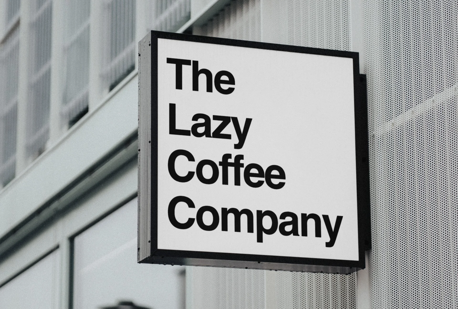
When seeing new coffee and cafe brands either on social media platforms or on the high street you will find a lot of examples of black typography and illustrations on a plain white background. I love seeing a black or white shopfront when strolling through a city centre and in the right locale, this lack of colour can pop out of a high street just as powerfully as the most vibrant hot pink. But this trend is becoming far too easy of a go-to for many brands (and brand designers) and I believe the ship has sailed here for this looking fresh and cool for new coffee businesses.
For example, you could opt for warmer palettes, a coffee itself has such beautiful brown hues from a dark, near-black espresso to creamy, light brown froth there is a deep and rich colour culture associated with our favourite morning brew. Coffee and cafes for me are cosy, autumnal and comforting which is why the black-and-white craze seems a bit too clinical, cold and formal. Of course, with every unique brand the solutions will contrast greatly and perhaps for a rush-hour-centric, high-flying, business-oriented target audience black and white would provide the perfect tone of voice, I’m just a little surprised to see it this often.
An easy avoid for new brands starting up in this sector as the brands who have nailed it own it and anyone else looks like the chasing pack.
Cartoons on EVERYTHING
I love a cartoon brand mascot; I think everyone does, which is why this is such a popular trend. It’s retro, playful, ironic and cool and very often designers and business owners will reach for the cartoon approach to provide a tangible image of their personality.
Cartoons are very much at home in fast food restaurants or on kids’ cereal packaging for example, but they’re not always relevant, and yet there is an obsession with sticking them on any brand that hopes to be quirky or vintage. We’ve ended up with cartoons on coffee brands, alcohol brands, and even more up-market restaurants and cafes. In truth, cartoons give off very different messages to the ones hoping to be conveyed by these kinds of businesses and while it does look kinda cool it may be confusing to your consumers.
The other problem for me is that sometimes the rest of the design work gets neglected in order to accommodate our cartoon mascot or forgotten entirely. A cartoon does not a logo make, and typography, colours and personality are still essential to provide a high-quality character and appearance. These cartoon mascots often act as a sort of ‘get out of jail free card’ that overrides all other need for design and sophistication which is not the case.
Use cartoons sparingly and don’t skimp on the boring bits!
Over-Custom Typography
Most legitimate fonts you will find on the market today will have been made by a professional and will have been meticulously edited and refined to as near perfect as said typographer had intended for your use. This is why it’s frustrating for me to see these fonts and typefaces be overworked, stretched and edited by someone who is less capable and qualified to do so.
There are a lot of rules and intricacies that need to be adhered to when designing typography in order to retain legibility and balance, and the trade-off of balance to adding a pretty flick or swirl here or there is not one that I encourage chasing with my clients. But this is what I see more and more brands (and brand designers) doing in the market and it’s often entirely irrelevant or unnecessary.
To me this communicates insecurity, having to go one step too far in order to snatch at a semblance of flair which in turn can do the opposite and make things look cheap and novelty. More often than not the typeface alone will provide the character you’re after, this is why they’re chosen by brand designers like myself in the first place and we don’t need to force some kind of ligature or symbol into the letterforms to make them more relevant. If you do then perhaps keep looking!
Choose a font that speaks for you without the need for modification first. If then a modification naturally presents itself, then by all means go for it (but if not it is also fine to leave it as it was intended).


