Aprilmädchen Cafe
Visual Identity Design for a Bakery & Cafe
The Client
Aprilmädchen is a cafe and bakery based in Nagold, Germany that specialises in topped toasts, baked treats and coffee as well as sourcing seasonal flowers for pop-up shops in the cafe. The brand has a feminine touch, becoming a go-to spot for female audiences in its locale but it needed an update to its visual identity which had grown a bit stale and didn’t match up with the business’ evolving personality and success. My job was to design an identity that embodied what the bakery/ cafe’s audience knew and loved about the cafe and seamlessly transition their aesthetic into a new and improved era.
Design Vision
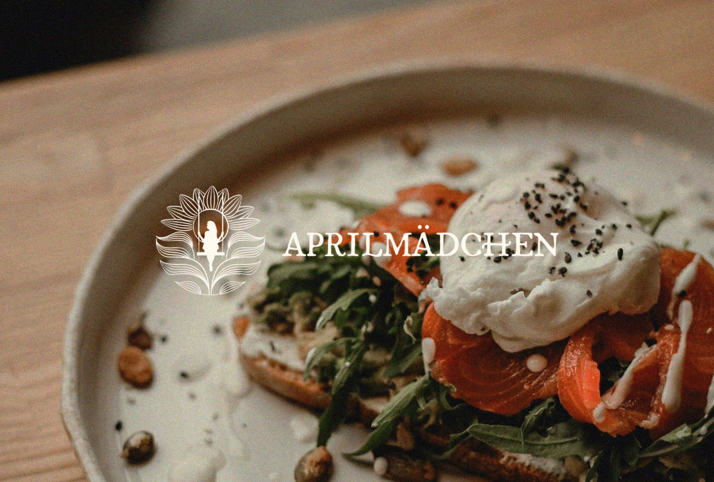
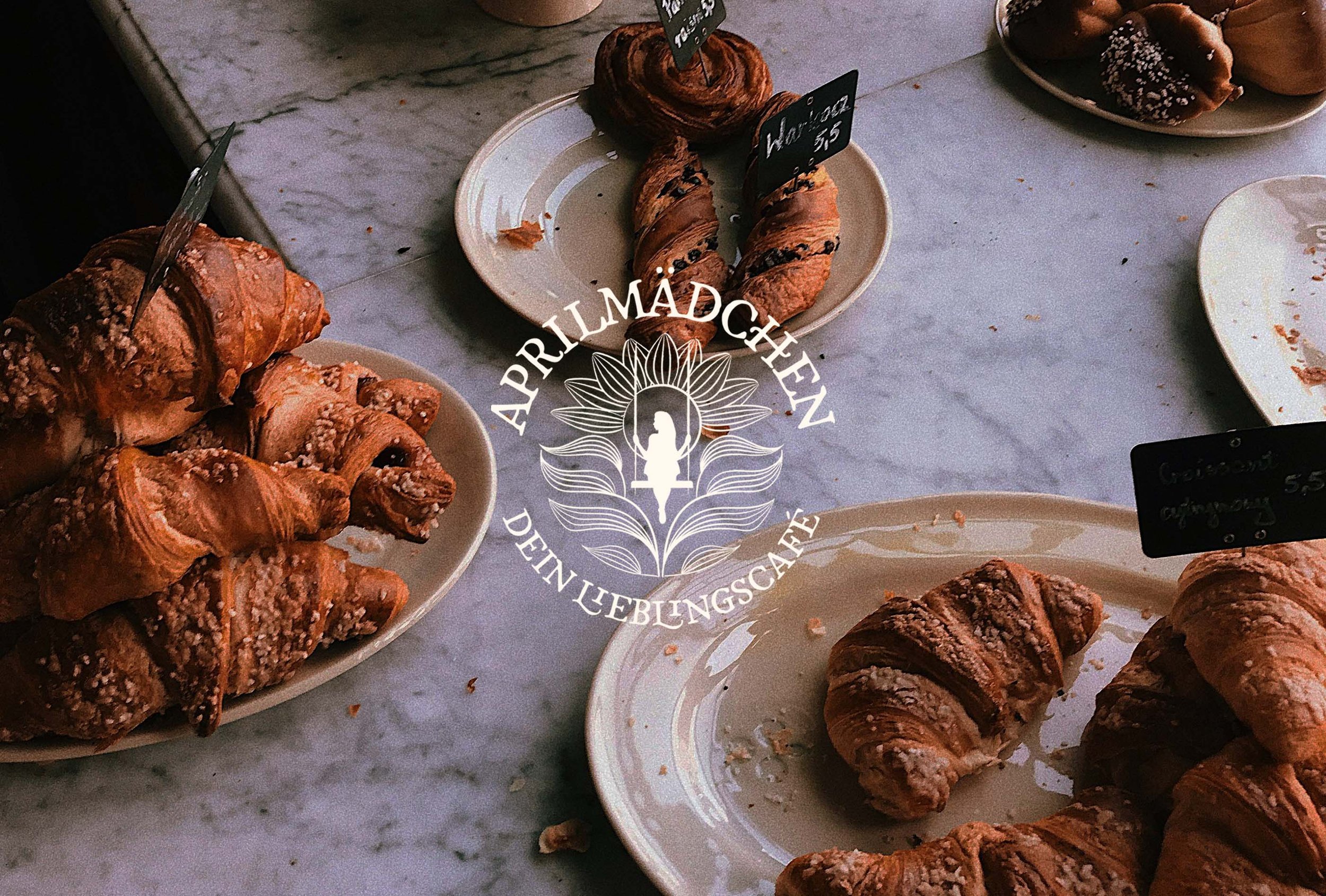
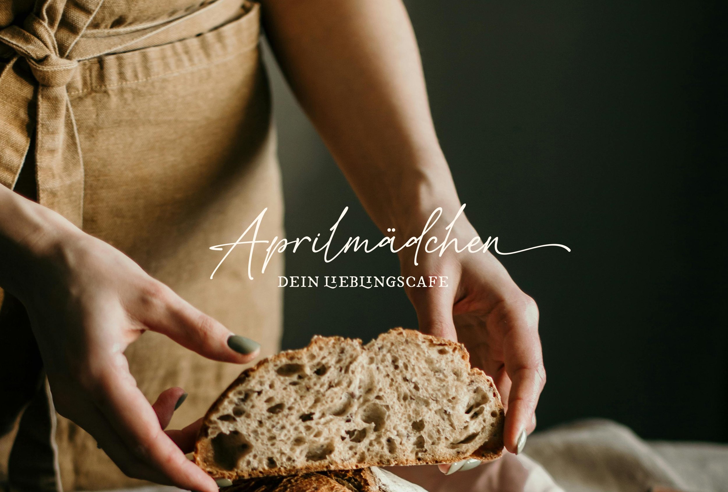
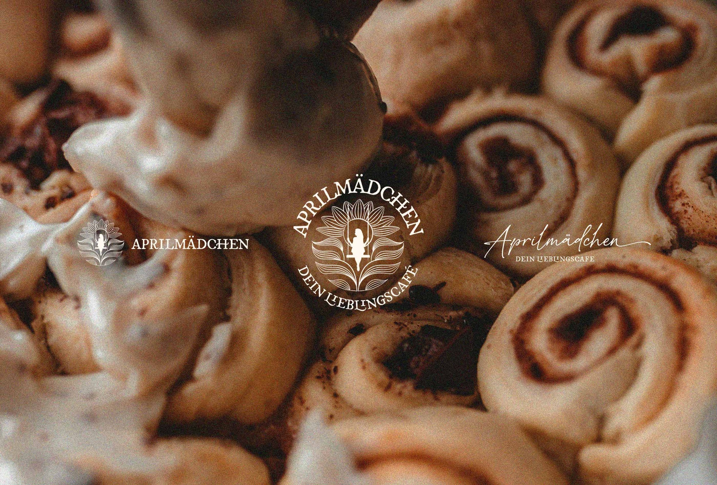
The client expressed a desire to keep their previous image of a girl on a swing as their icon. A lot of the challenges in the icon then concerned creating a good-looking portrayal of this and balancing it somehow within the bounds of a logo. I chose to encapsulate it in a circular frame adorned with seasonal flowers to show the natural ethics of the brand as well as the titular ‘April’s’ themes. I wanted the logo to show hand-made, artisanal qualities which I could achieve with the right choices of fonts and subtle textures in the elements’ timbre.
Creative Decision Making
Icon Design: The girl-on-swing icon was presented in a silhouetted art style, opting for a simpler option here proved optimal for appealing to a wider audience as well as neatening our overall composition. Presenting the ropes of the swing (essential for showing it was indeed a swing) provided a unique challenge that left the icon looking awkward and unbalanced when displayed independently but with the framing within a circle, I was able to spread linework around the entire perimeter of the silhouette and provide balance with an artistic flair and texture.
Typography: For the typography to accompany our icon I chose fonts and typefaces with a hand-drawn quality to them, not only to match the texture of the illustrations but to enhance the themes of the hand-made, artisanal products in the cafe. Our hero typeface created a heritage, European aesthetic which contrasted nicely with another hand-drawn script font for detailing and body copy.
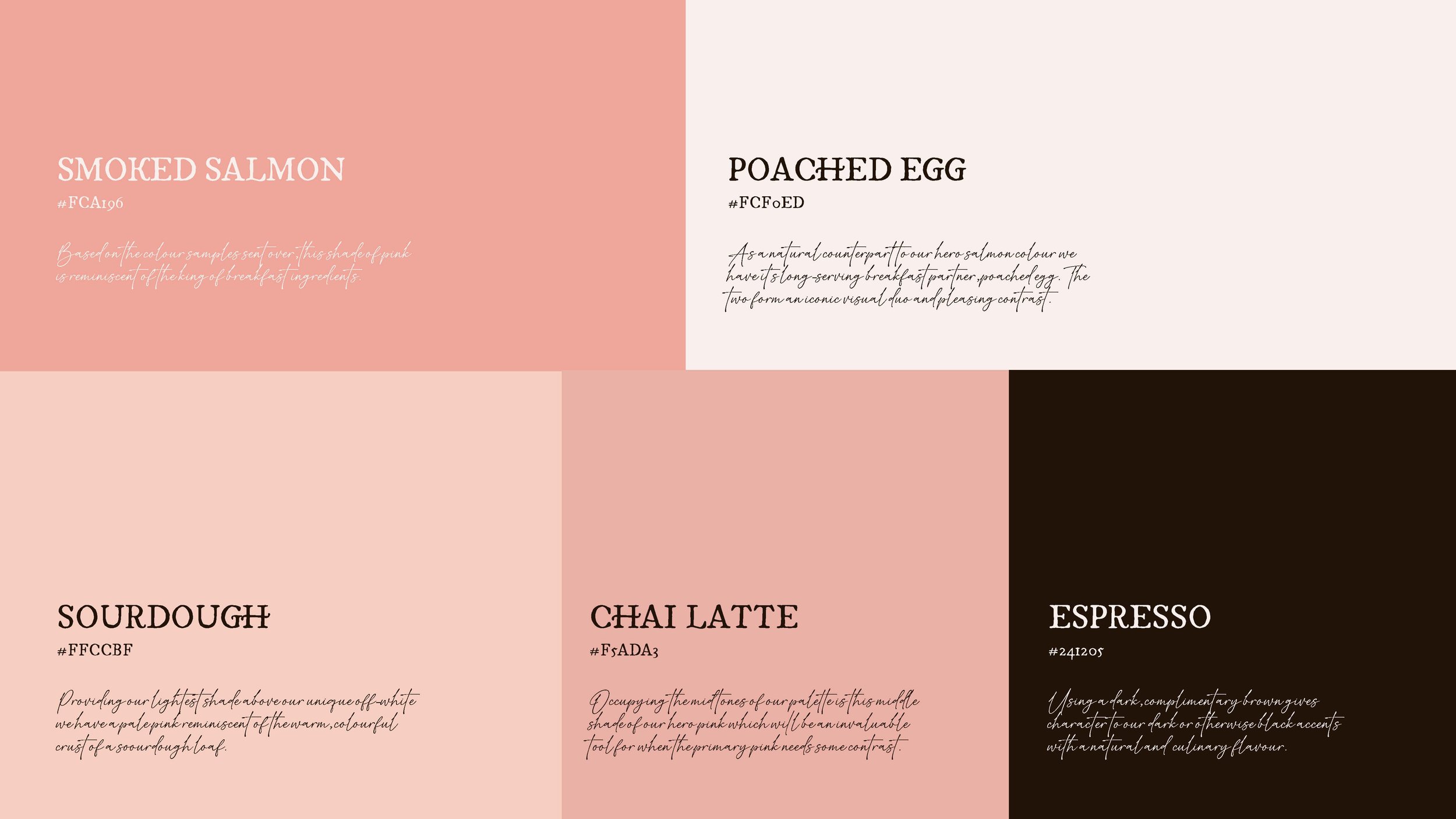
Colour Palettes: A particular pink was selected by the client which would be used for the cafe interior design of which I paired with iconic colours of cosy cafes. The iconography of eggs on sourdough toast and coffee with cake is hailed to with the careful choices of colours that came together to provide our cosy palette with a healthy helping of pink.
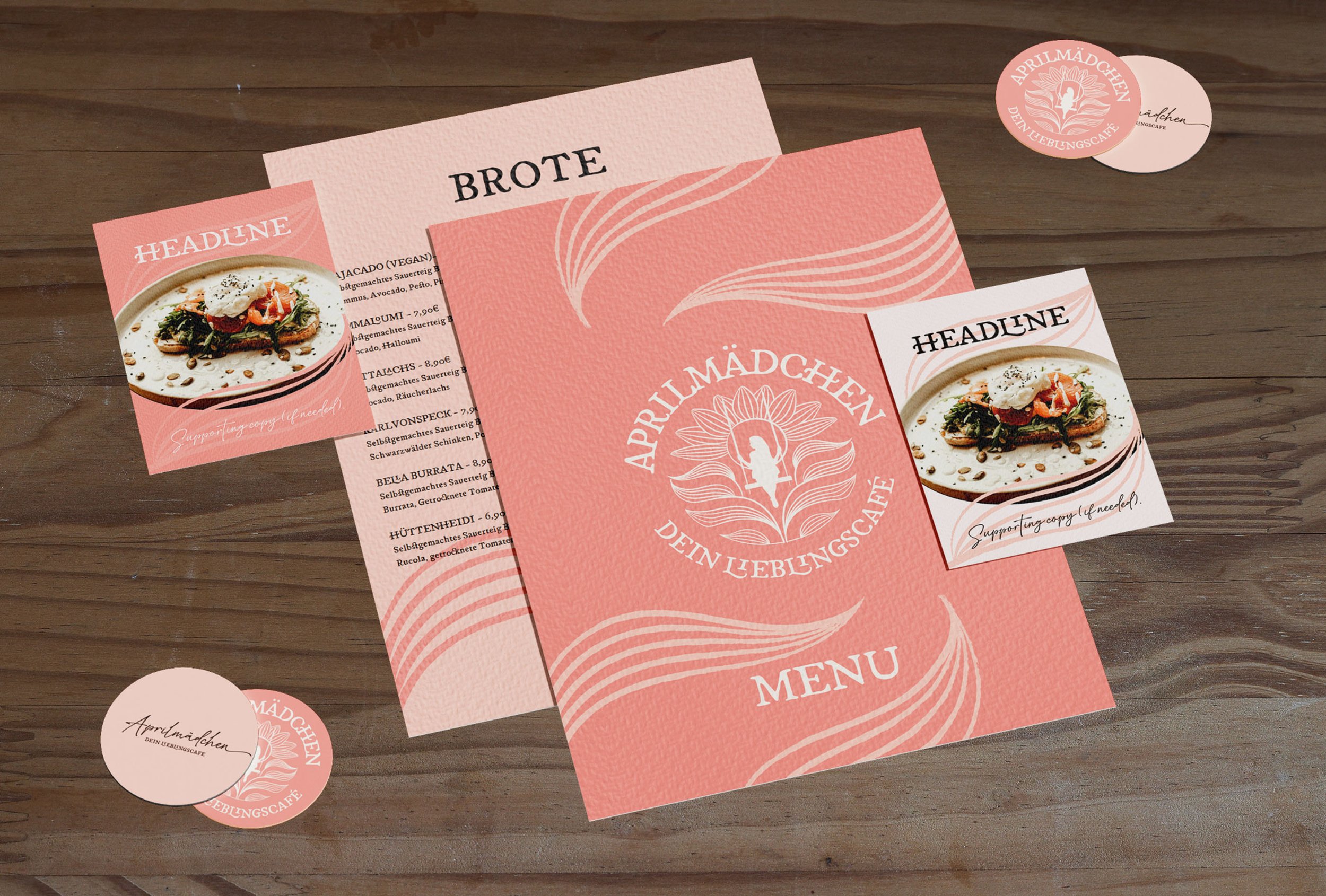
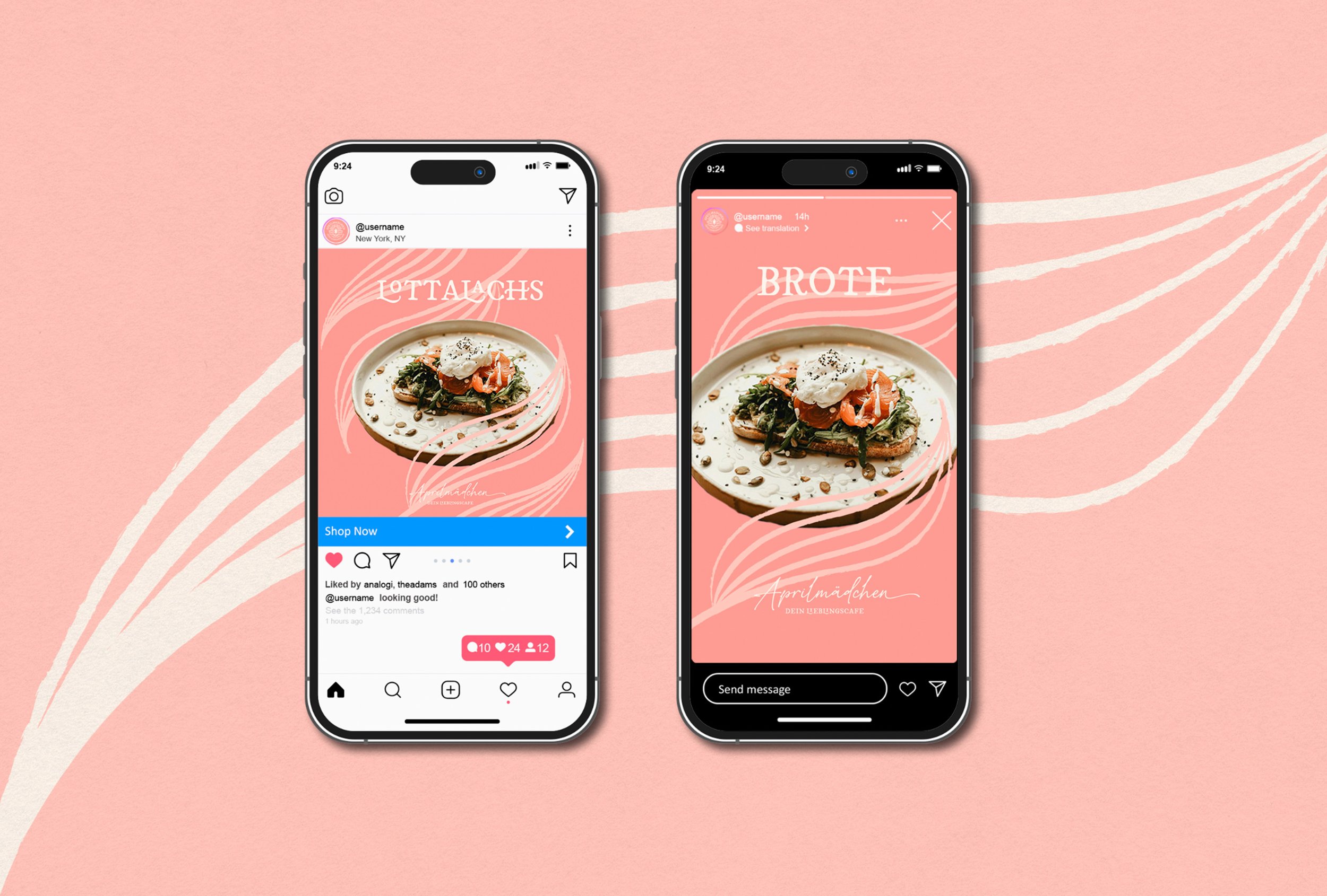
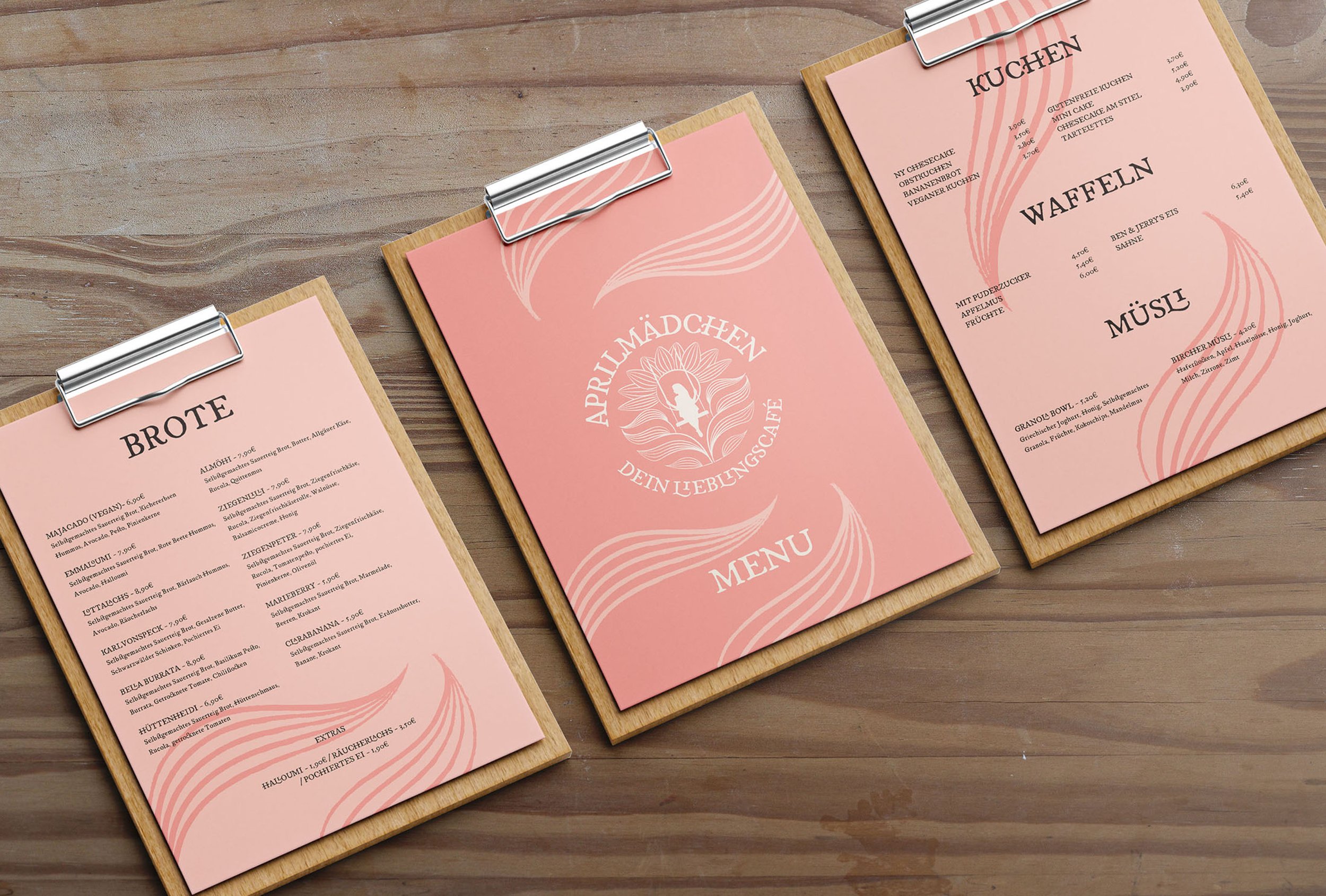
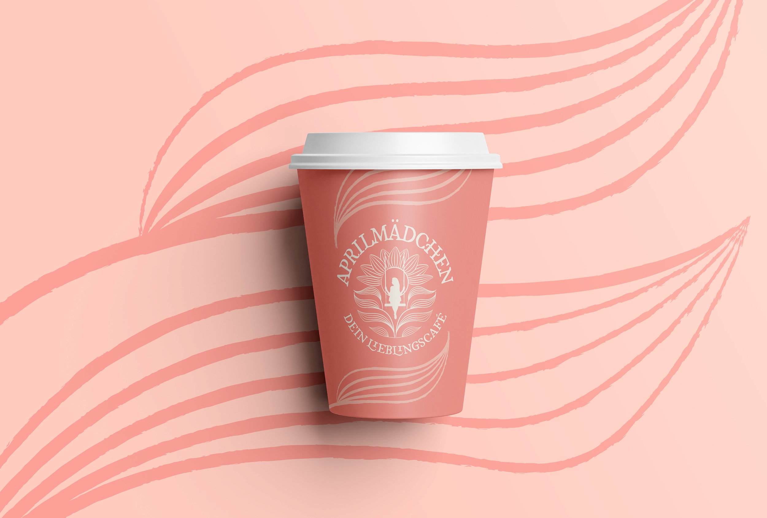
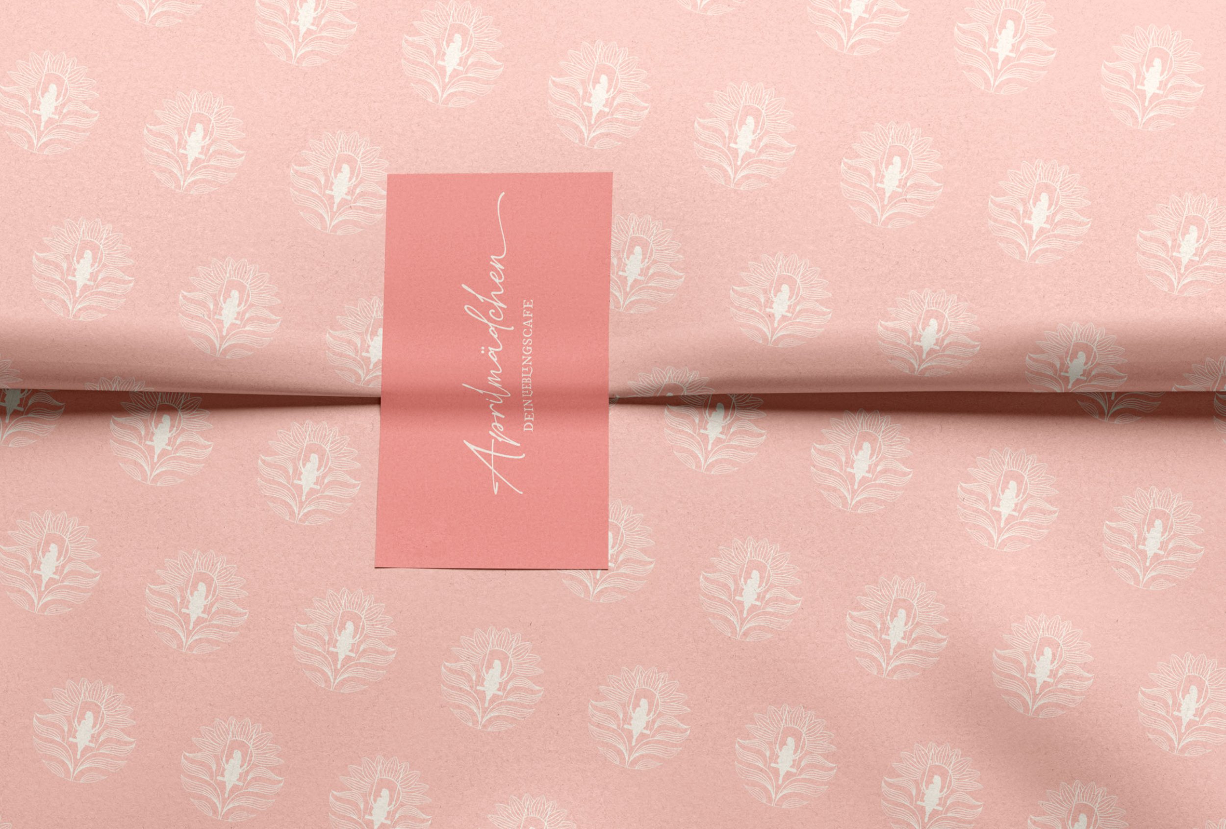
Art Style: The illustrated icon provided a simple solution to patterning and artwork, using leaves from the icon’s composition to contrast backgrounds and frame content giving print and digital assets a sophisticated artful look. The leaves could stack up to resemble the full flower as they do in the original icon or be used more sparingly independently on applications that needed a bit more breathing space.

Implementation
The flexible and balanced colour palette along with the simple and elegant patterning solution provided simplicity in designing print and digital assets, which is essential for me to give my clients the power to run their businesses independently. Similarly, the typography choices made things very clear and efficient for churning out content long-term with style and legitimacy. The overall identity design made it very hard to make things look bad or unsophisticated which gives my clients the assurance that they need to run their visual designs with confidence and trust.
Results
The clients were thrilled with their new identity designs, having the confidence and inspiration that a brand refresh provides they are excited to roll out the content onto their physical and digital brand update. The hands-on and collaborative process provided a lot of new information and ideas for them to implement in their brand strategy going forward and they are in the process of updating the cafe’s interiors which I am excited to see.
Conclusion
This was a very fun and inspiring project to work on, this is a great example of how a rebrand can really breathe life into a business and provide inspiration for a business’ identity and direction. The initial brand that was put in front of me was better than a lot of brands on the high street today but knowing when it’s time to upgrade is a subtle skill for business owners to know to keep progressing and advancing on their goals towards success.

