Schwarzwald’s Finest
Visual Identity Design for a Men’s Fashion & Outdoors Brand
The Client
Schwarzwald’s Finest is a men’s streetwear and outdoor fashion store in the Black Forest of Germany. They act as a one-stop shop for men’s fashion in their store and online, with products ranging from garments to camping gear and even housing a bespoke barbershop in-store. They had already established themselves within their community online but were looking for a brand design refresh and a new look to more effectively align with their audience.
Design Vision
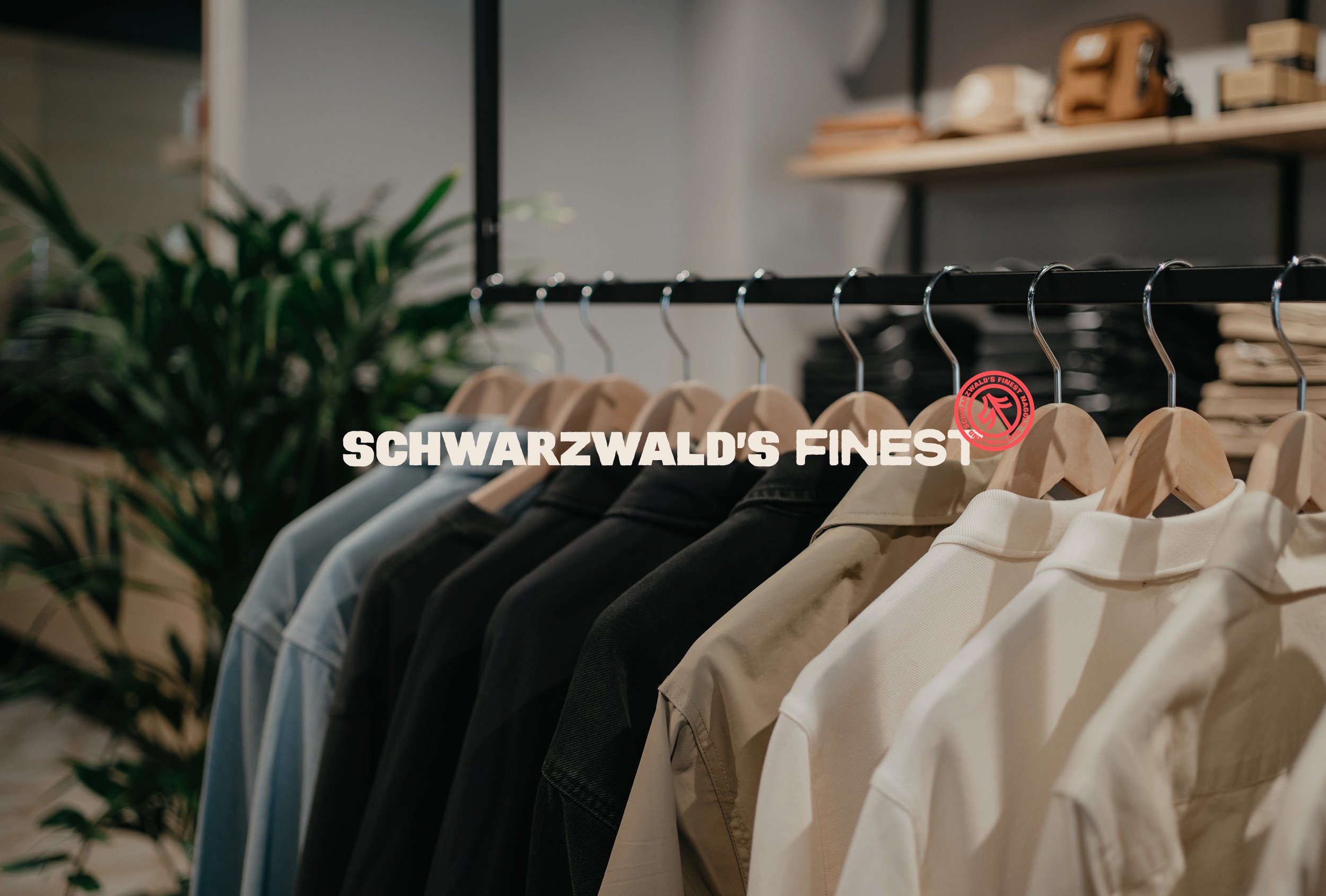
The vision behind this project was to design something that encapsulated this male-centric product range from streetwear to the outdoors with the inherent themes of the store’s location in the Black Forest, a place that embodies this love of the outdoors and getting your hands dirty. In order to give both streetwear and outdoor vibes we had to balance cool with practical, modern with nature and dapperness with ruggedness. Influences for the identity were outlined as successful workwear fashion brands and retro car and motor branding. This was to be a brand for the dapper dads, the camping connoisseurs and the well-groomed workers.
Creative Decision Making
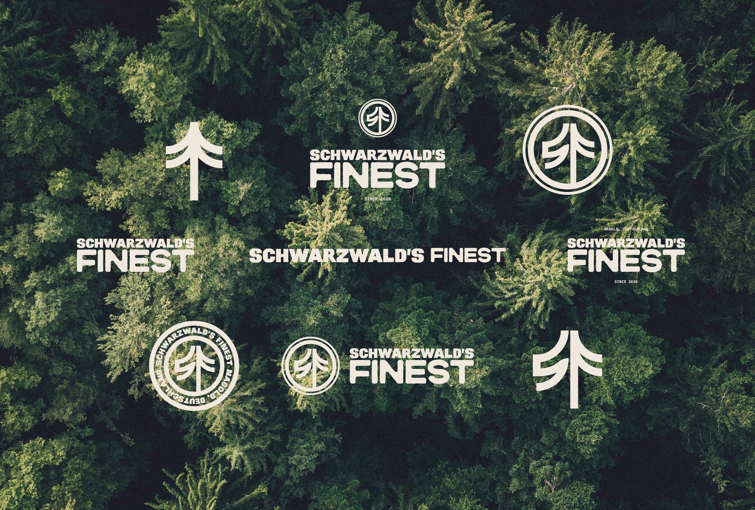
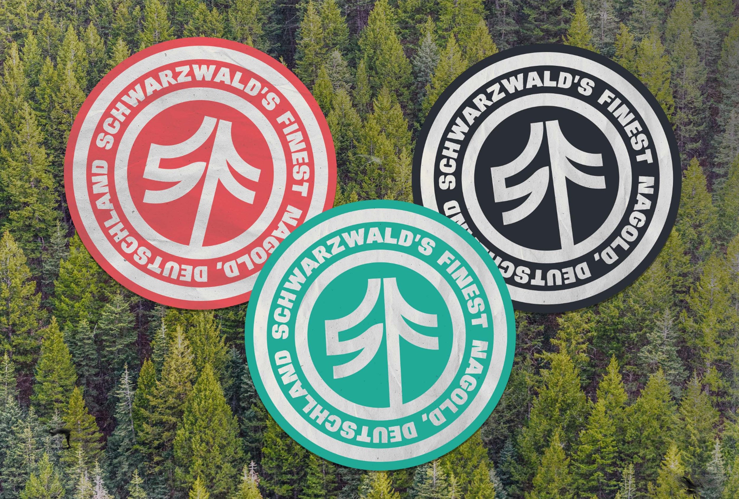
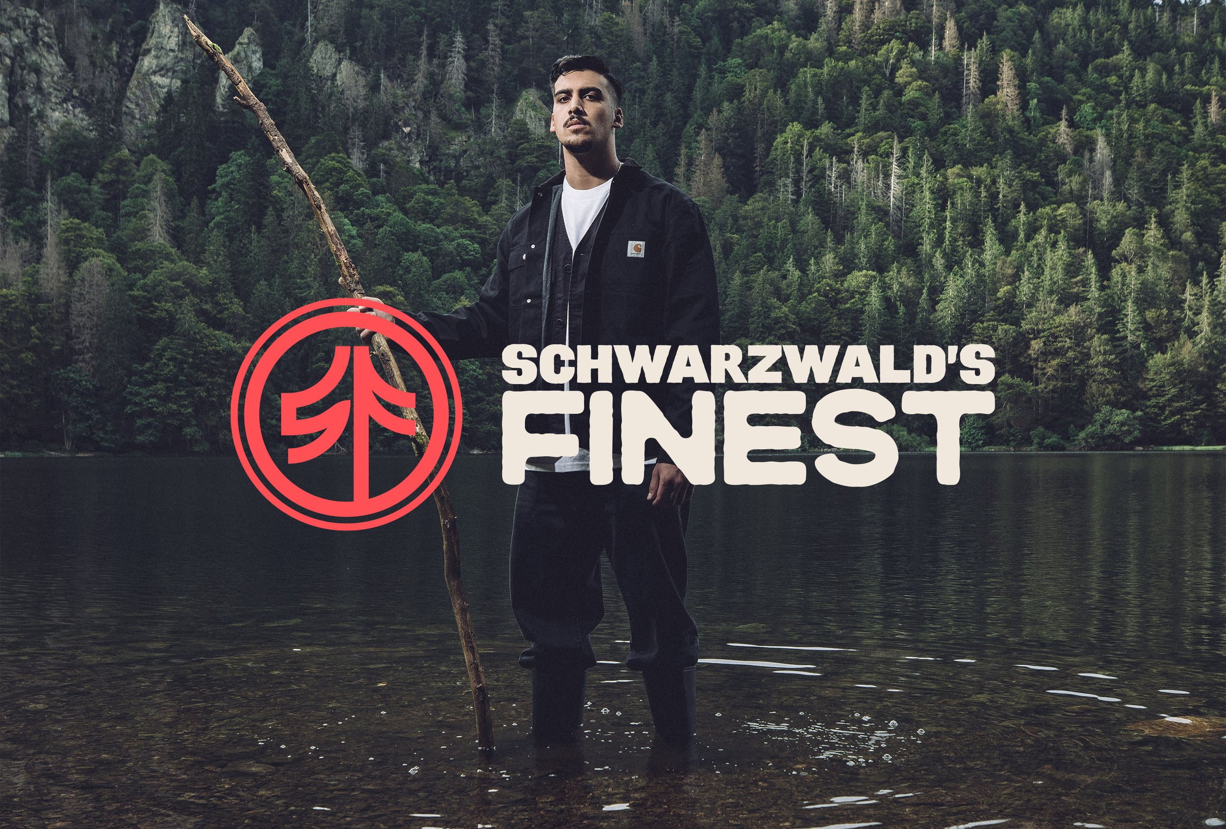
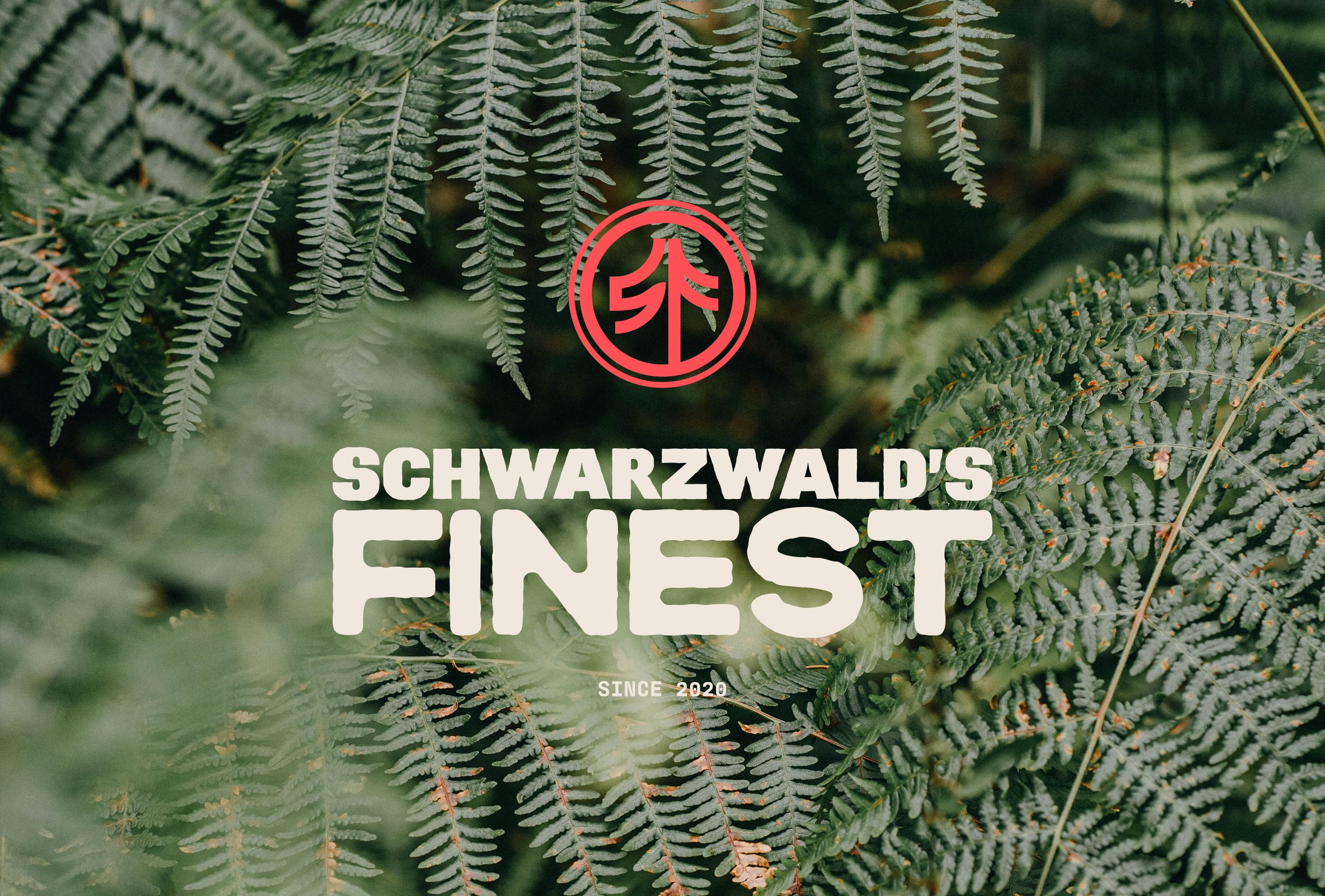
Icon Design: The icon took the form of a custom monogram, which doubles as a Pine Tree, quite literally connoting the ‘Black Forest’s Finest’ and what makes it fine: its foliage. We played around with a lot of potential heroes for our icon, but this tree, illustrated in a modern minimalist style, gave us that balance between nature and modernity that we were after. The S of the SF monogram draws the inverse of the tree within its negative space and overall gives a symmetrical balance and modern iconic look.
Typography: The typography uses two similar all-caps sans serif fonts, one clean and modern, the other rough and rugged. The contrast gives this minimalist typographic wordmark a subtle interest and makes the title look sophisticated independently of any supporting elements.
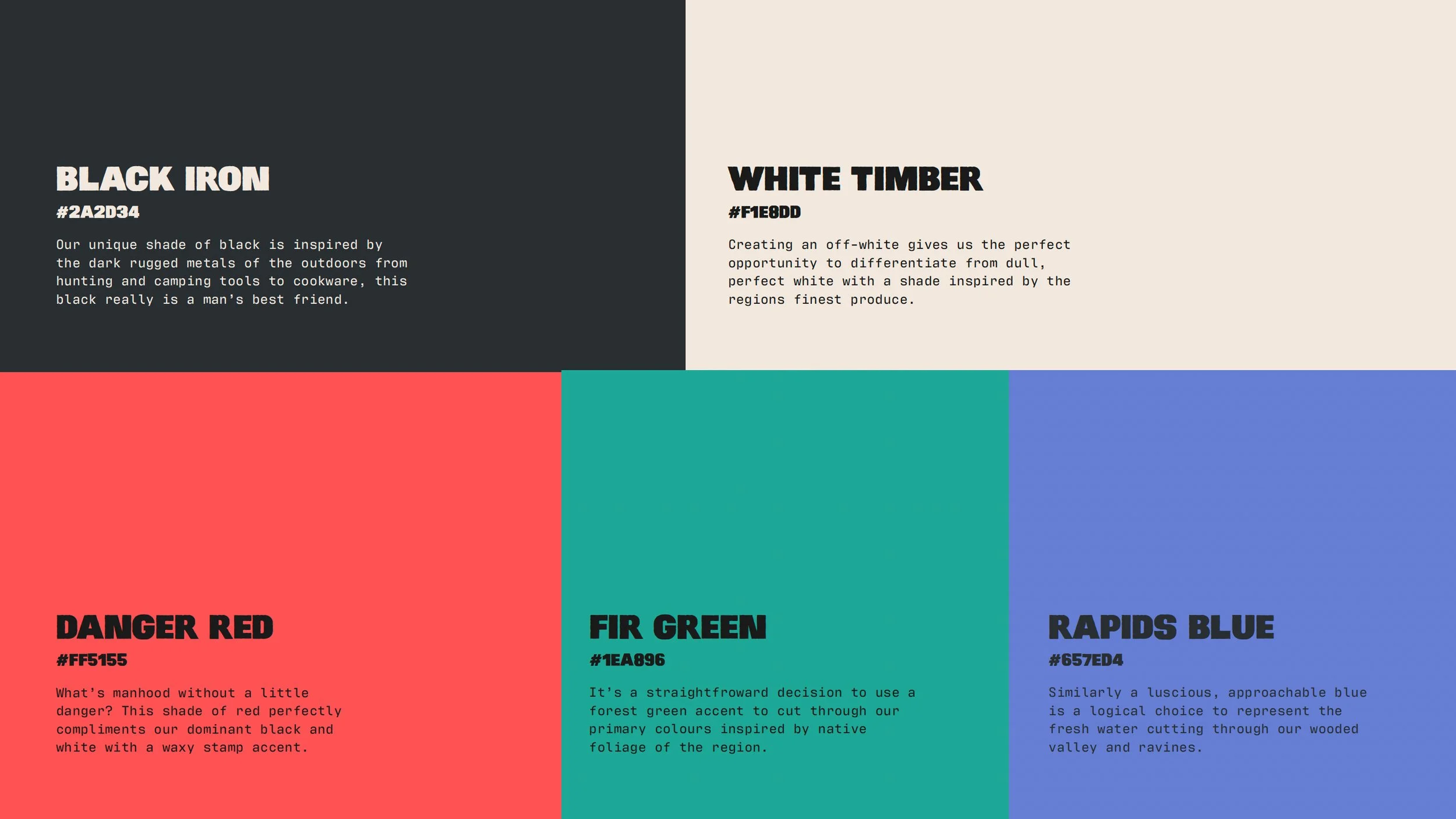
Colour Palette: The colour palette originally favoured a black and white palette, this remained relevant but wanted to make it their own with a more rugged shade of cast iron black and off-white reminiscent of fresh timber. This naturally was inviting a strong red to cut through on the accents of the branding which was enhanced with the colours of the landscape being a forest green and rapids water blue. The palette is born from a love for the outdoors.
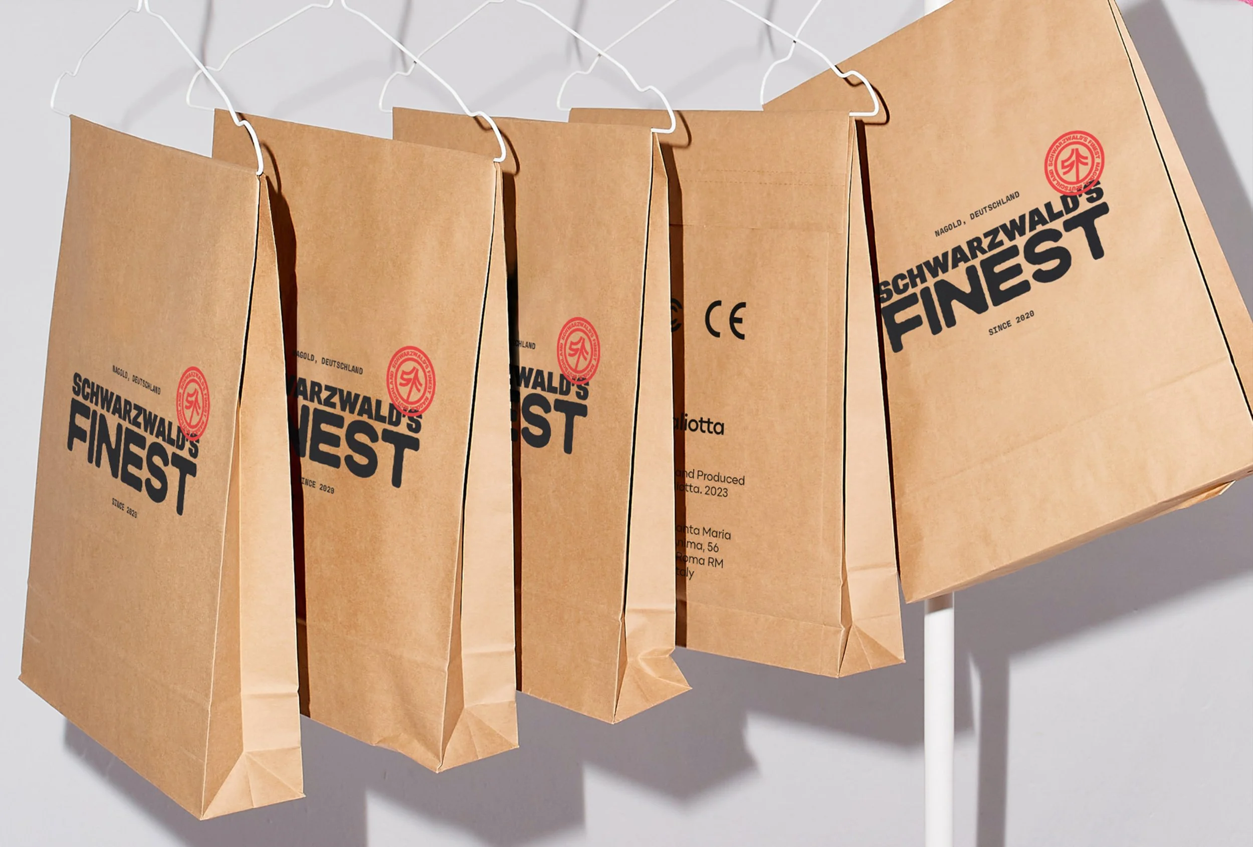
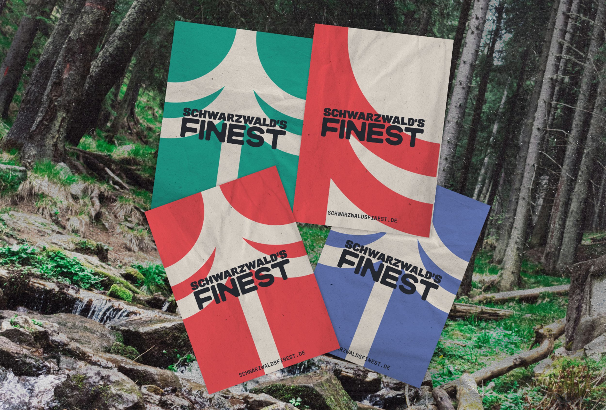
Brand Elements: The circular icon format made it a great stamp for our branding in either our red or blue shades. This simple overlaying technique really can add a new dimension to print and merchandise design and offsets the duller-looking layouts. The monogram illustration was also made into a regular, symmetrical tree icon which could be used for layering in brand assets.
Implementation
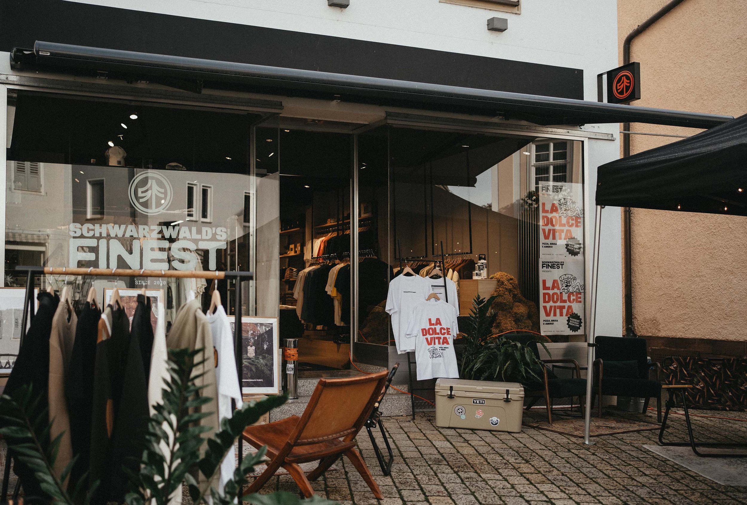
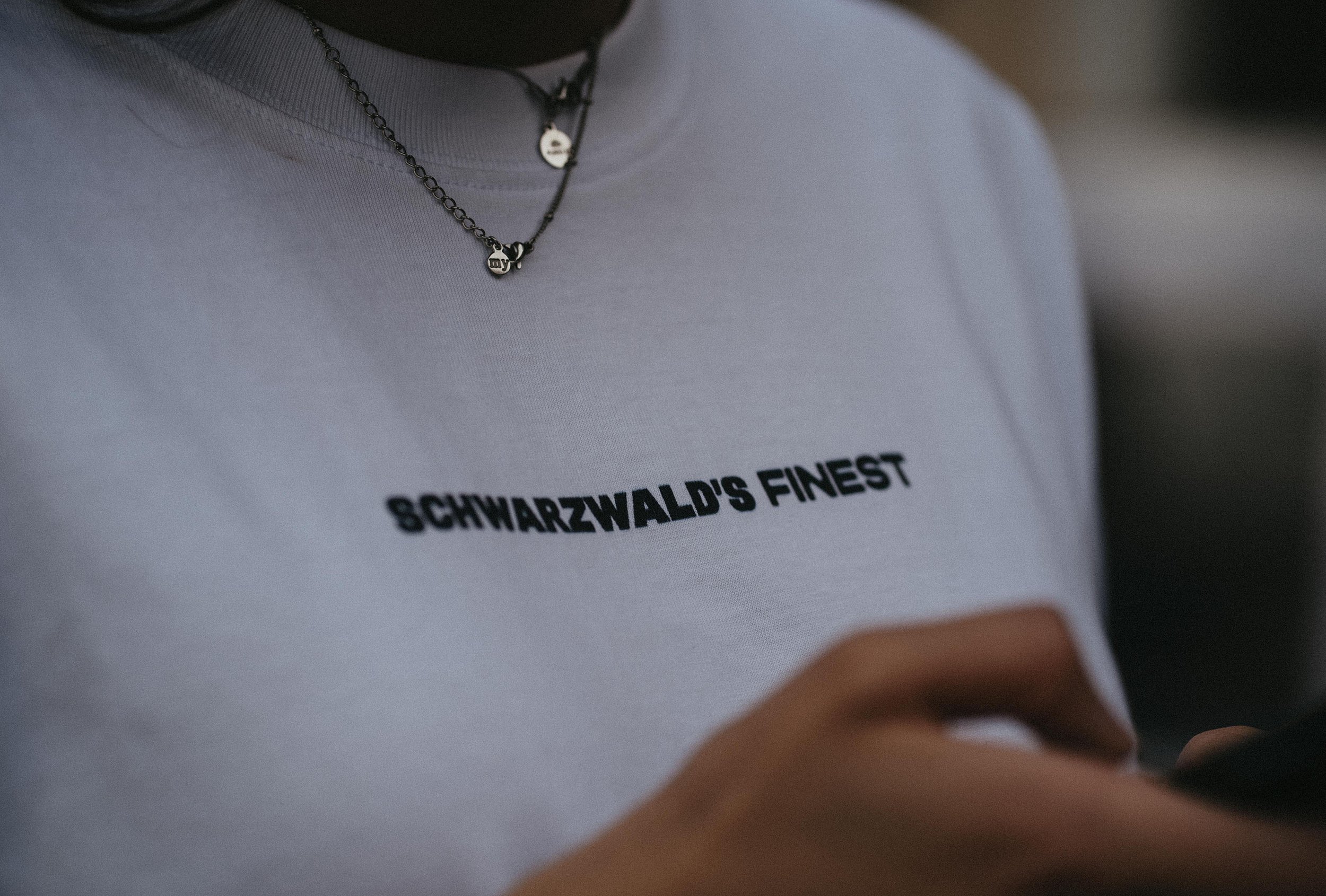
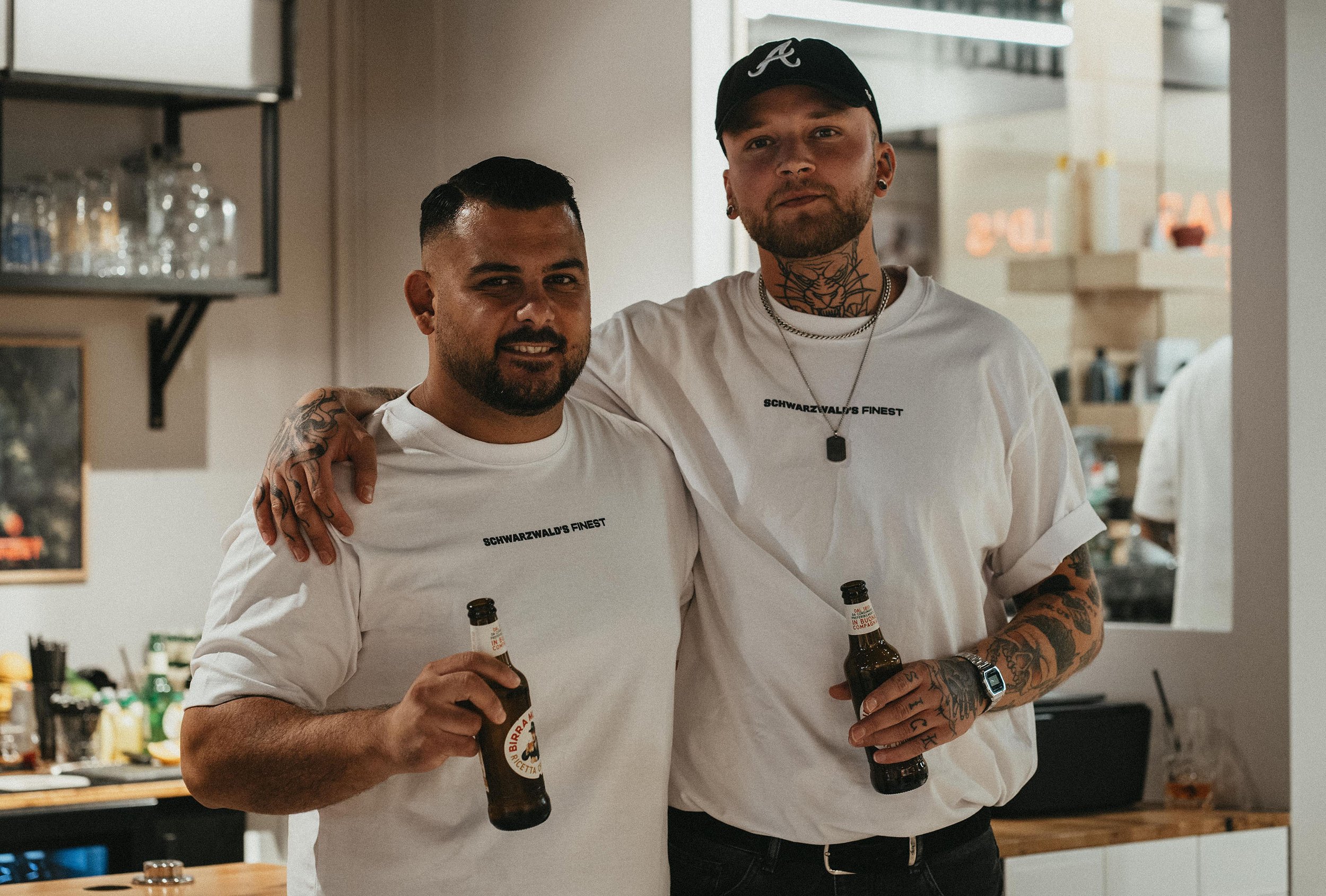
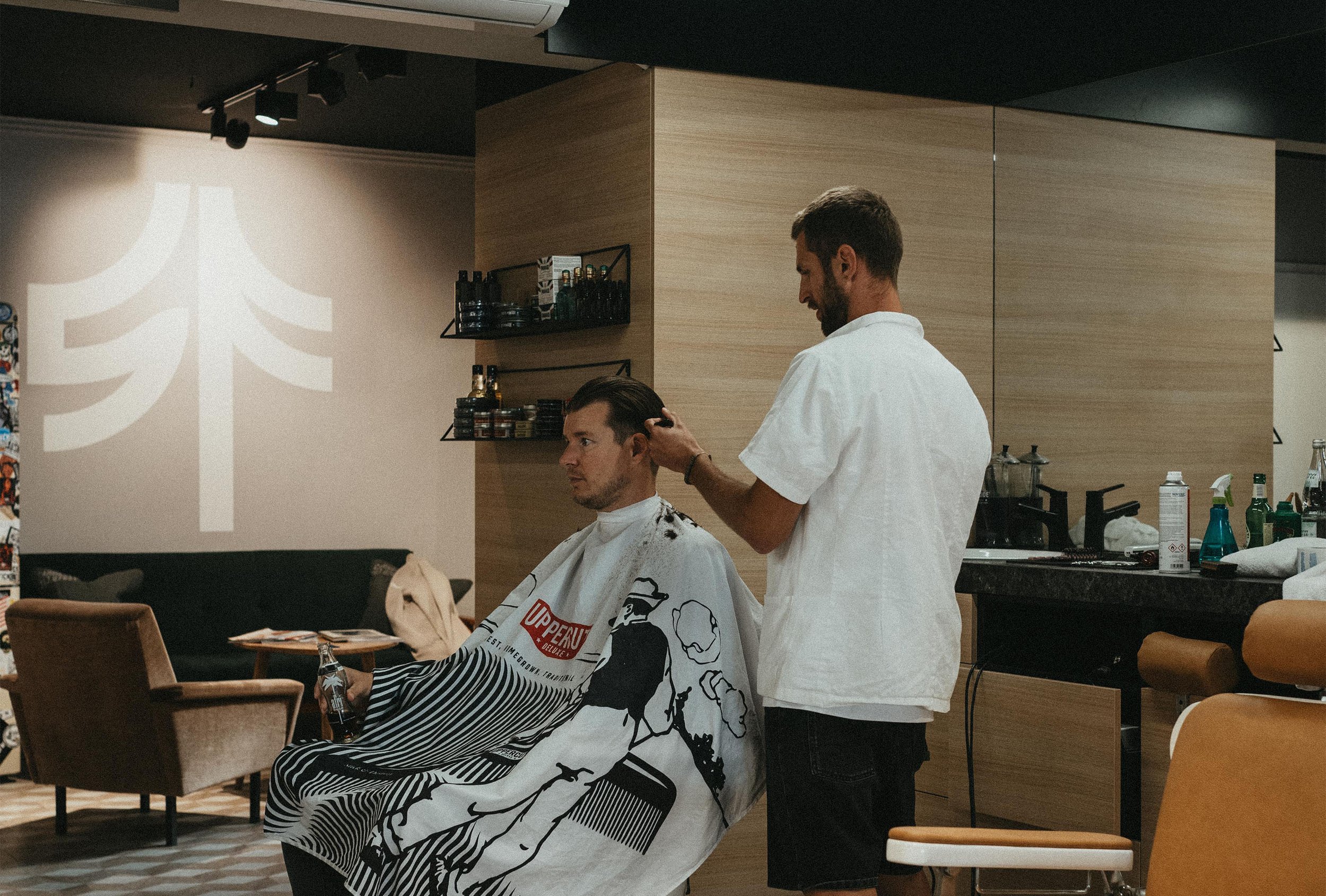
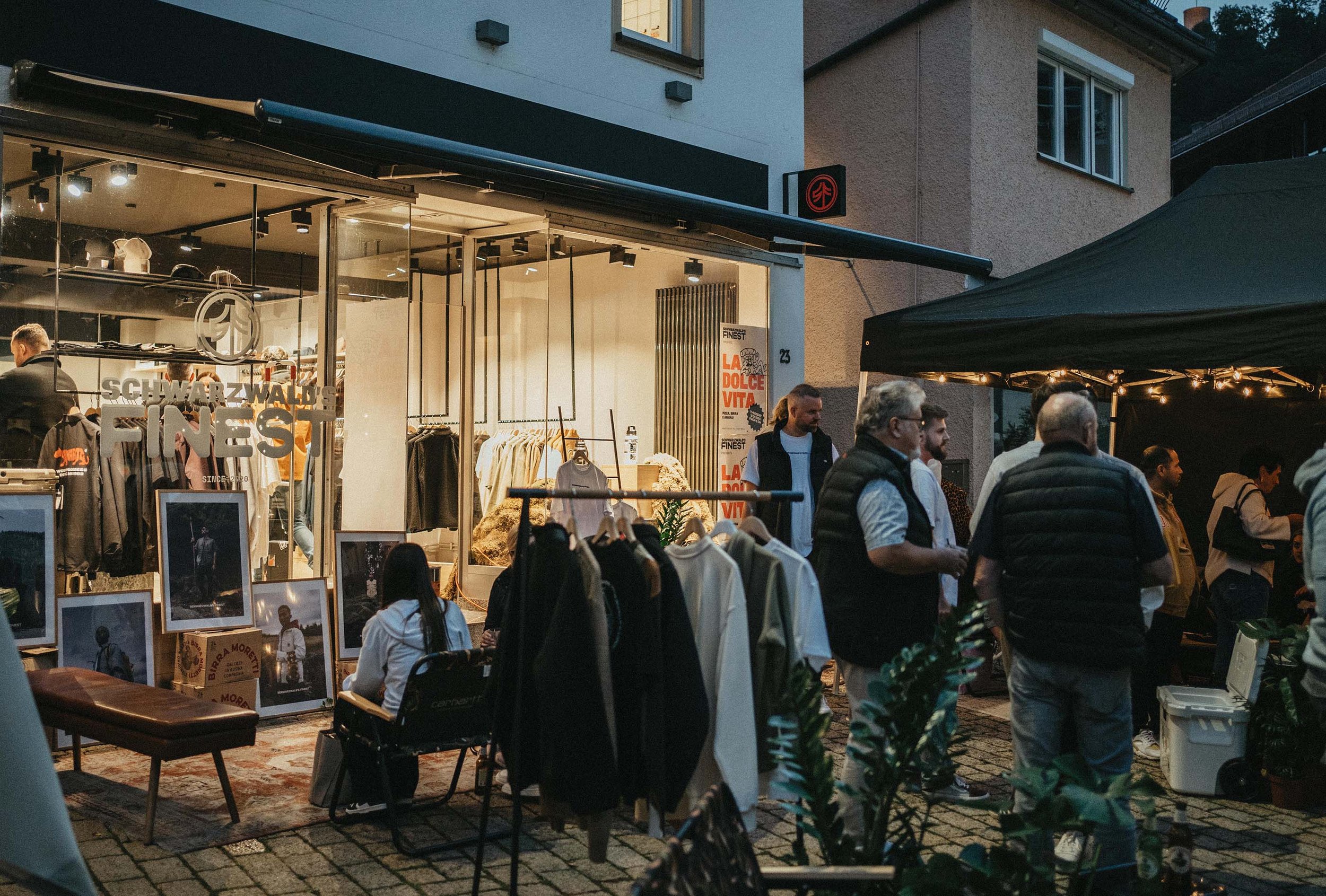
The logos and brand elements were spread across plain white tees, stickers and shop window signs, and stickers were plastered in any spare spaces to give a consistent identity to all that was Schwarzwald’s Finest. The full responsive logo suite meant that the business had a logo that fit every application of their upcoming campaigns, and they remained versatile in all of their long-term endeavours. They began with a shoot of their newest line of products for the website and went on to renovate their shop and open with a launch night, collaborating with local businesses to spread the word about their new campaign.
Results
The shop and website were given a fresh new look and confidence to believe in the next push for their business. The credibility and sophistication that a well-tuned visual identity gives acted as a platform to push the brand to greater heights online and within its locale. The clients were overjoyed with the outcomes of the project and how well its launch was received, and I had a blast working with them to bring this to life.

Conclusion
This project in my mind, is a testament to effective collaboration. The client was efficient in communicating their desires and gave me the utmost trust in my skills and know-how. It was a tricky ask to redesign a brand that was so close to being right and create something that was a lot more on-the-nose for their audience but through the strategic research and meticulous alignment processes that I push with every brand identity design project I work on, I believe every project can be as successful as this and I am so thrilled to see my clients thriving in their new campaigns.
