Willyum’s Margarita
Visual Identity Design for a Canned Cocktail Brand
The Client
Willyum’s make all-natural canned cocktails and aim to start by introducing a variety of flavours of Margarita onto the market from Colorado, USA. They are a brand new player in the fast-growing market of canned cocktails and wanted to make a splash on supermarket shelves whilst staying true to their roots. The legitimacy and sophistication that a well-designed visual identity brings to a brand new business are invaluable in providing the confidence, credibility and personality that are essential for success in today’s market.


Design Vision
Margaritas are lively, zesty, energetic cocktails with vibrant Mexican origins. Whilst the client intended to make sure this brand would be very much an American and modern personality, the character on offer here from the pre-existing ideas of the beverage is undeniably powerful and positive. I wanted, then, to design an identity that was as lively, exciting and flamboyant as a Margarita and its homeland whilst grounding the brand with more modern, clean and American touches.
Creative Decision Making
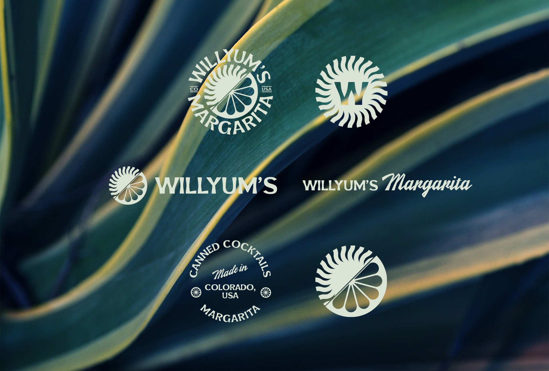
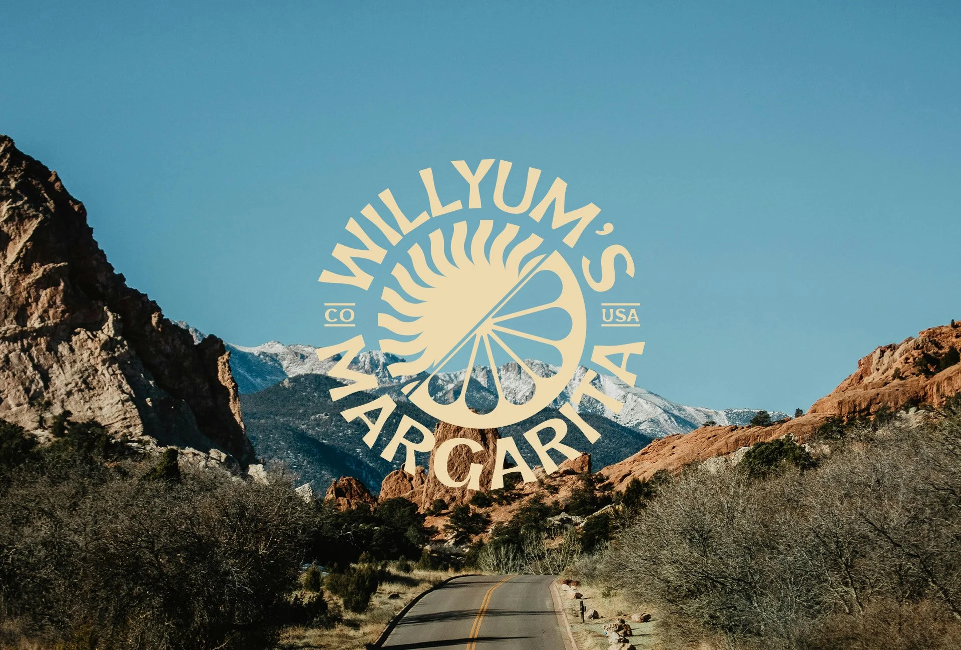
Icon Design: The lime was almost too easy of a starting point when looking for iconography to use in our logo designs, but when drawn in its most minimal form this made a lot of sense to pursue. First of all, our minimalist patterned lime icon gives reference to retro American entertainment logos, setting a period for our overall identity and with the clients’ plans to create alternative flavours, our lime icon could just as easily represent any citrus slice. When paired with a bohemian-inspired sun pattern, we not only give a hint of Mexican charisma and summer vibes but create an abstract embodiment for the fusion of our cocktail.
Typography: With the desire from the client to remain retro and bohemian whilst presenting the personality to their audience, this typeface leapt out as a front-runner. It gives us a retro Western quality whilst giving a hint of Mexican flavour and its all-caps variant was essential for providing balance in this rounded logo format. The hero typeface was paired with a script font of the same qualities, retro and western and gave contrast to copy when needed.
Colour Palettes: One colour was for certain going to feature in our identity for a margarita company and that was an agave-green. This shade was chosen to represent the main source of tequila, our cocktail’s base and provided a unique shade of green to lead our branding. To pair with this darker green, I added a lighter green shade reminiscent of mojitos and margaritas, this shade would be our own off-white shade and could be used instead of white to inject a blast of character whenever regular white was needed.
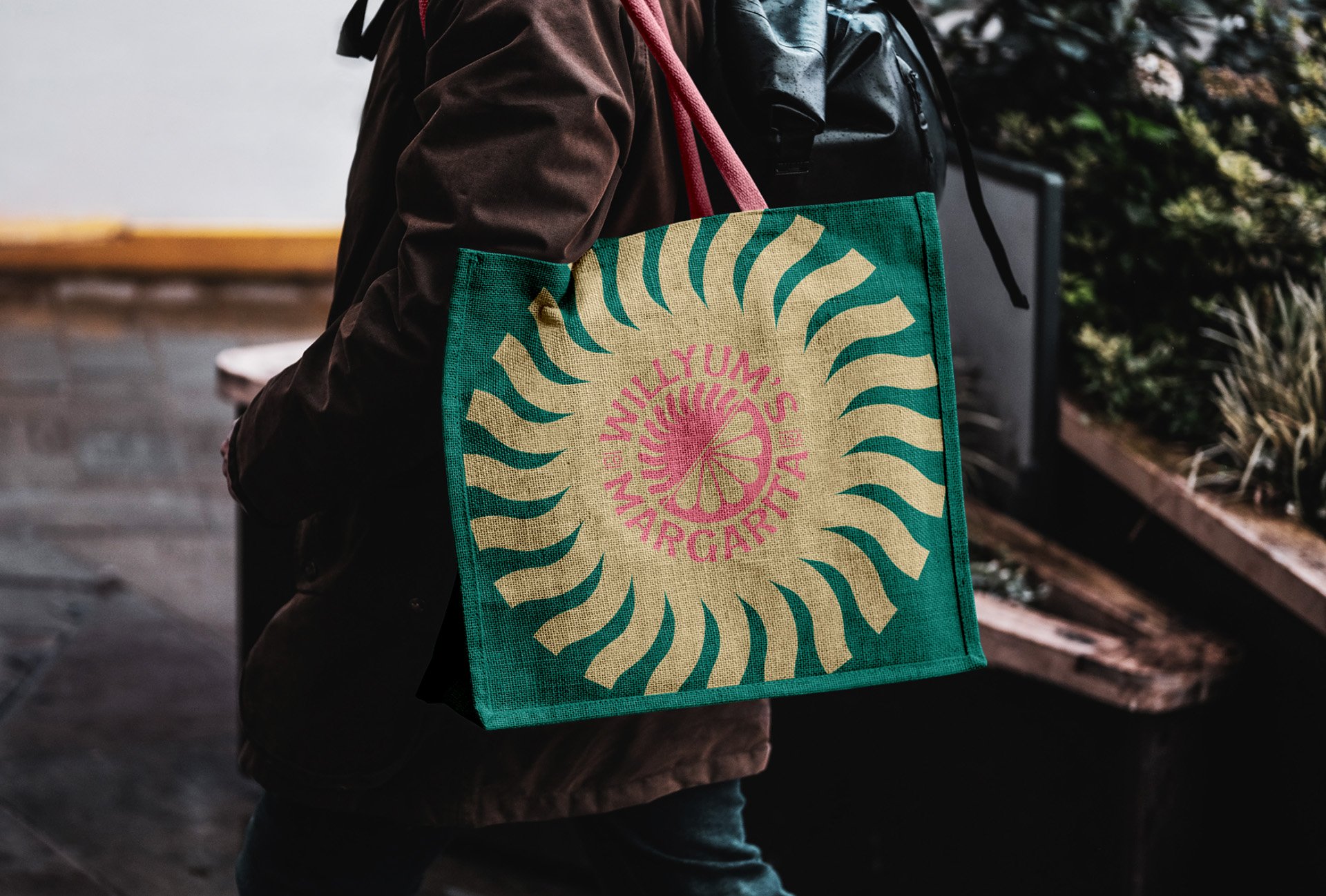
Art Style: Our bohemian icons gave the perfect base for patterning and brand artwork, the sun engulfs any copy or imagery needed and can shake up any plain block colour background to add some contrast to proceedings. A retro, typographic stamp was also made to nod to the luxury exports of our tequila and margarita cocktails.



Implementation
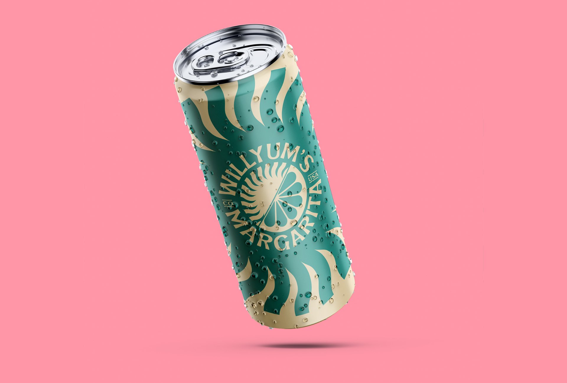
The balance of our elements and patterns made designing brand assets very starightforward for my clients to create independently if needed. The elements being centrally aligned along with the logos or typographic stamps look effective with the simplest compositions and really stand out in the wild. The mockup of the concept can design is shown above with the intention of bursting out of any supermarket shelf. The actual can designs are yet to be designed.
Results
The clients were love their identity and are empowered by the confidence and legitimacy it provides to their business’ emergence into the market. The identity packs a punch visually and provides and instant injection of personality to assets and product packaging.The tasteful composition of elements ensures the credibility and sophistication of the brand whilst still looking exciting and charismatic, a delicate balance that many businesses fail at.
Conclusion
Entering the market as a new business is daunting and expensive, which can lead to businesses losing confidence, cutting corners and taking gambles. Willyum’s saw the value of a well-designed visual identity and invested early into their brand’s credibility and legitimacy, which will in turn, fast-track them to trust and recognisability for their audience. With a strong and strategic visual brand identity designed, creating sophisticated and stylish assets to present to your customers is simple and efficient. I look forward to seeing Willyum’s on a supermarket shelf near me.

