The Siren’s Catch Seafood Restaurant
Visual Identity Design for a heritage Seafood Restaurant
The Client
The Siren's Catch is a seafood restaurant situated on the English coast, aiming to build a brand identity that reflects the rich character and history of seaside towns and fishing communities. The client wanted and personality that would evoke the legendary tales of seafarers, aspirations of epic journeys, and the textures associated with sea adventure to breathe character into their seaside pub restaurant specialising in seafood caught locally.
Design Vision
The vision for The Siren's Catch's brand identity centres on encapsulating the cultural heritage of fishing and the vibrant stories of local fishermen. I wanted to weave a compelling narrative of myth and legend through typography, textures, and imagery of the period that these stories would have flourished in. And to celebrate the lives and tales of those who work the sea, enhancing the restaurant's atmosphere with a rich history and culture of storytelling and community.
Creative Decision Making
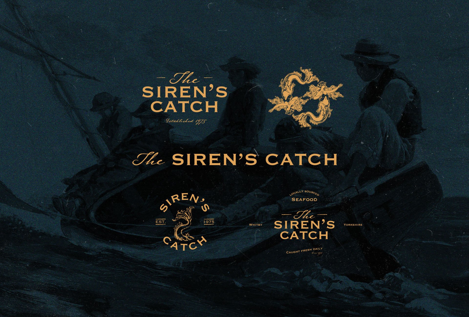
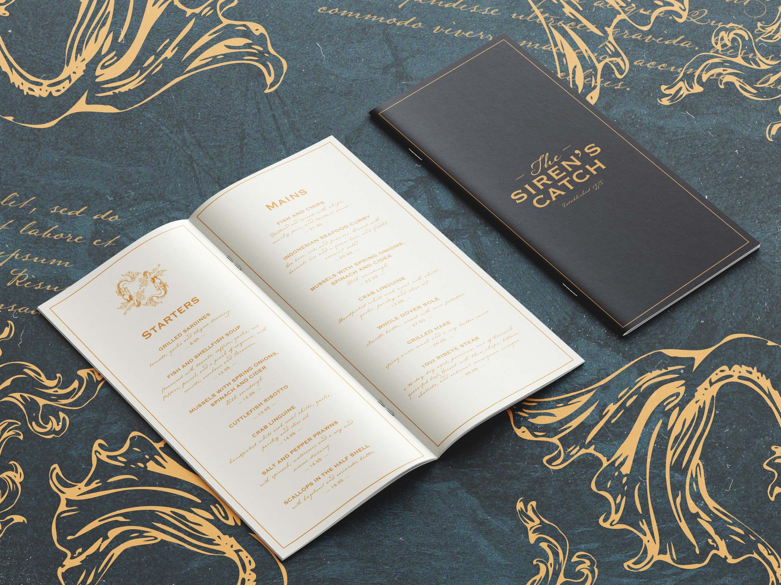
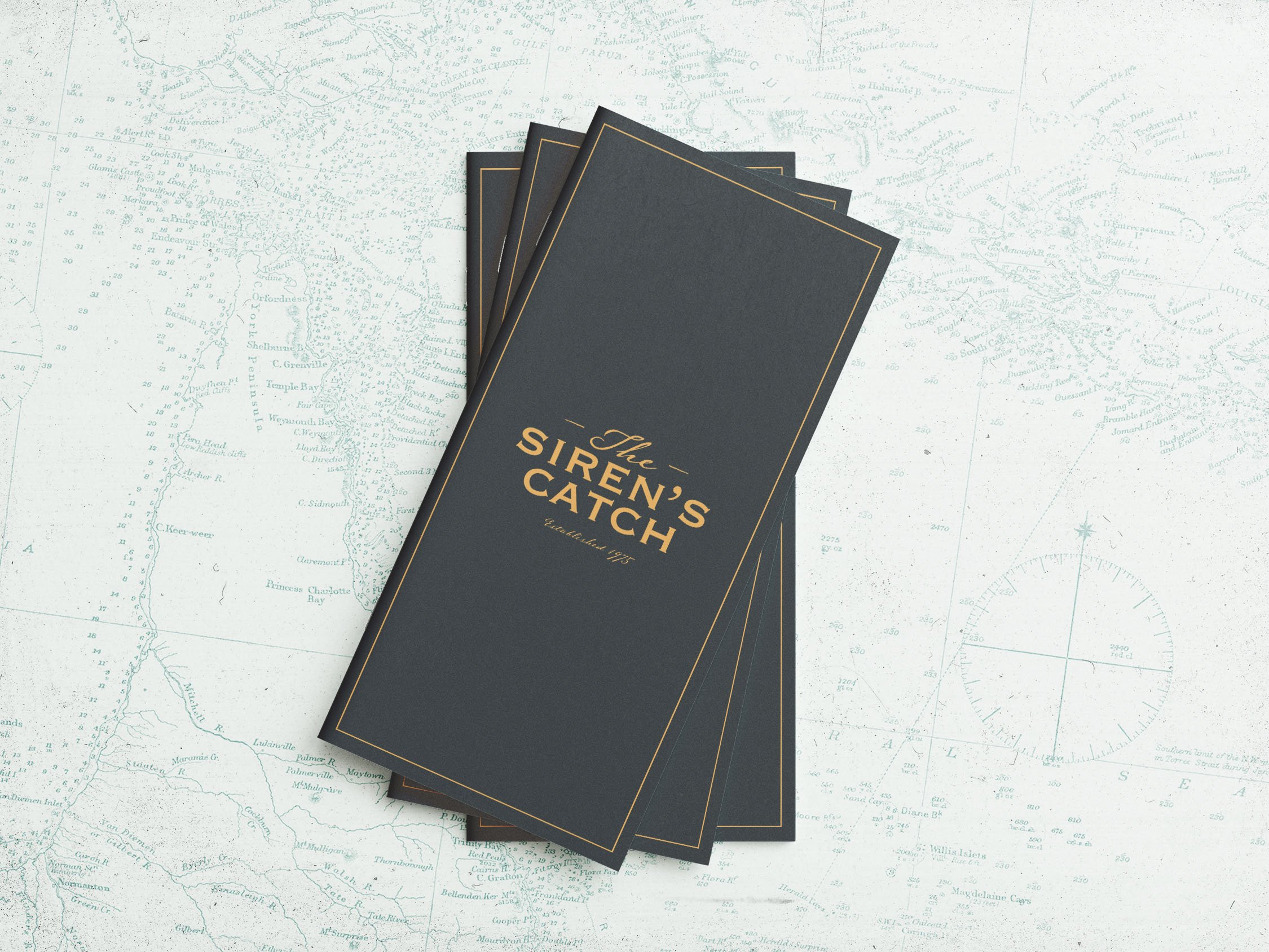
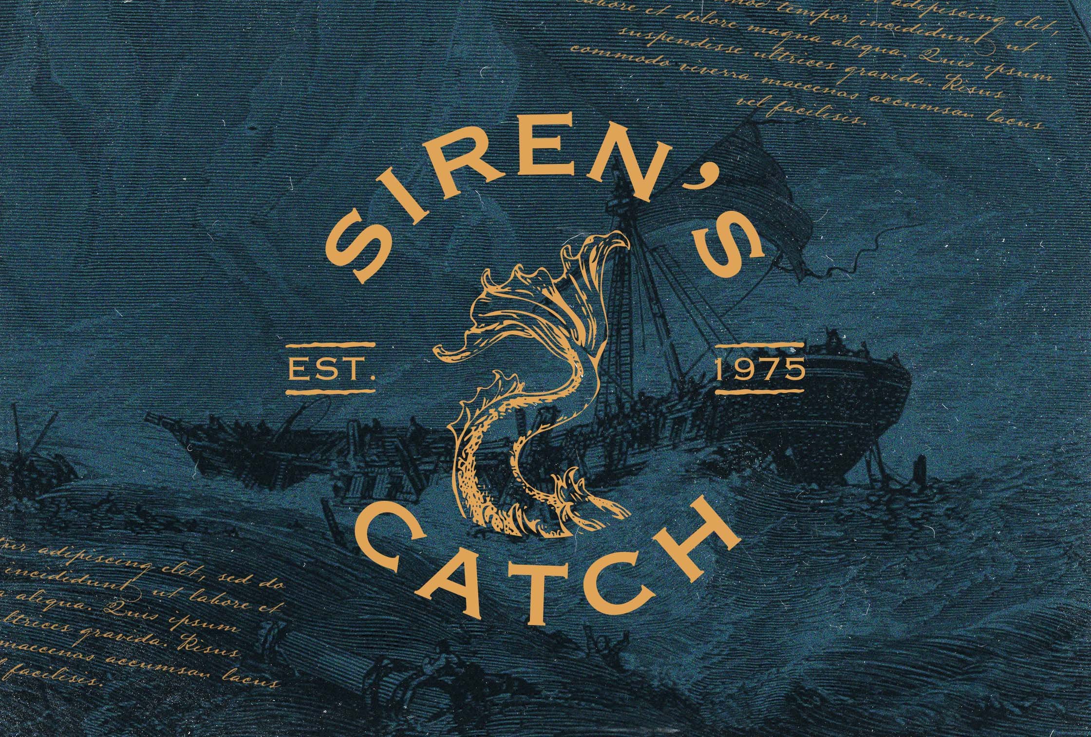
Logo Design: The logo features a copperplate typeface complemented by an ink-pen script font, evoking a vintage aesthetic reminiscent of traditional pub signage. The lettering incorporates subtle distortions, further anchoring the brand with historical maritime signage of the period.
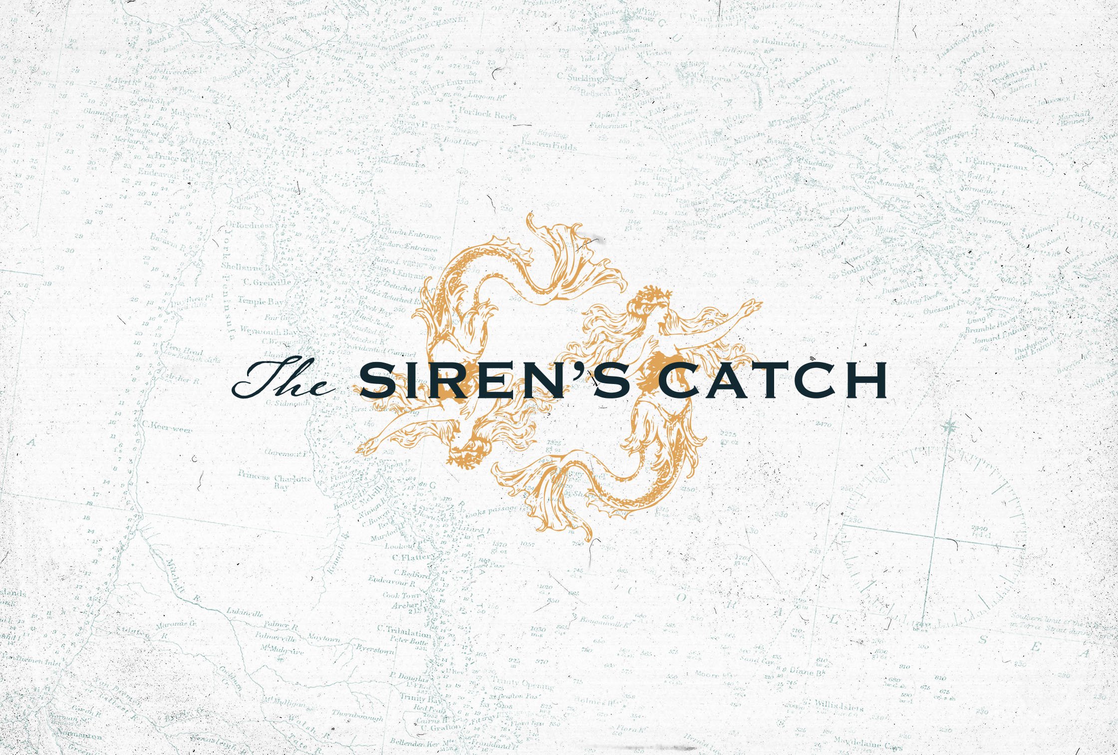
Icons: An etched Siren illustration adds a layer of mystique and serves as a distinctive brand symbol. This imagery is consistently applied across both print and digital materials, reinforcing brand recognition.
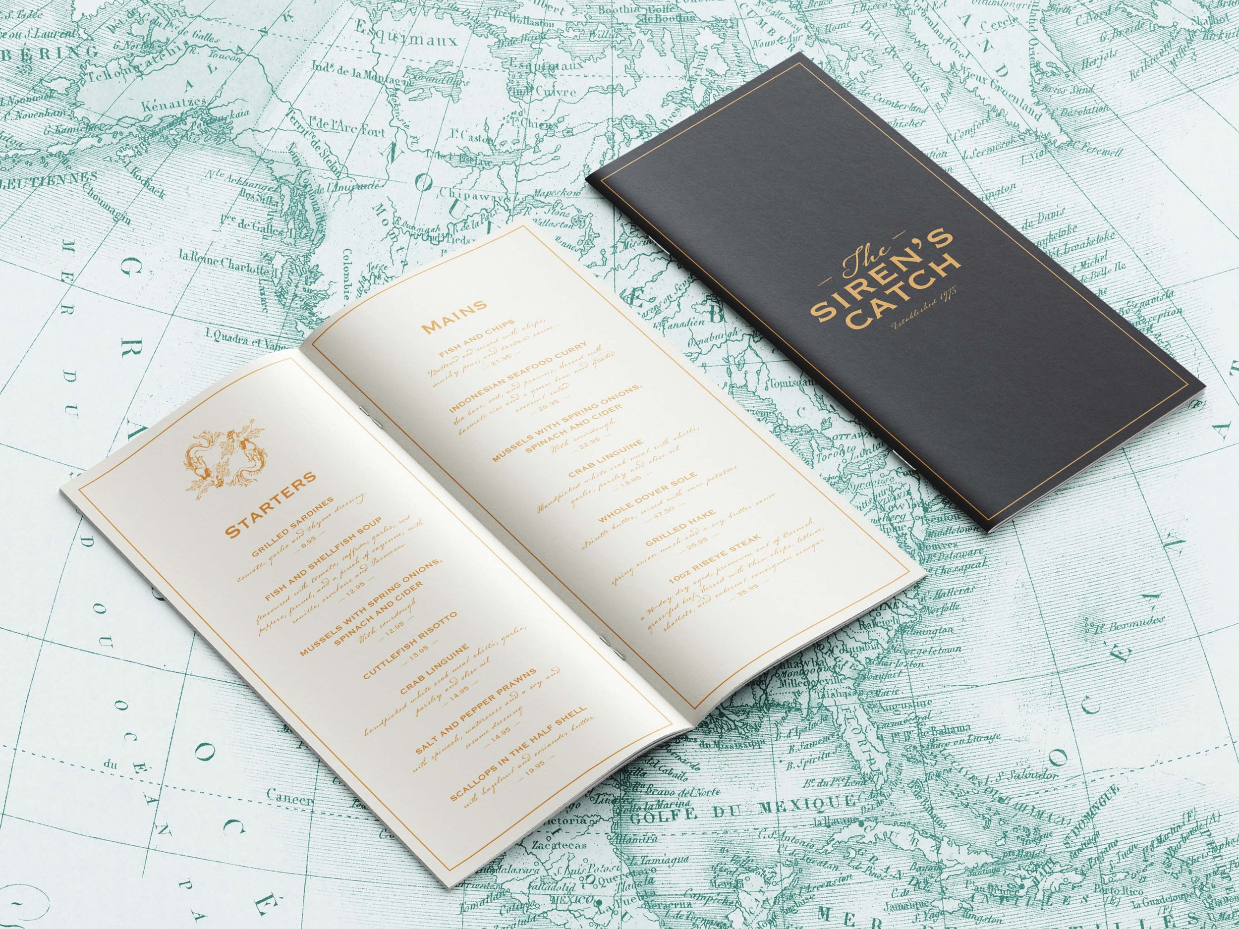
Typography Choices: The copperplate font is used for headings, while the ink-pen typeface lends a handwritten quality to body text, reminiscent of a sailor's journal filled with tales of adventure. This choice deepens the connection to the fishing culture and highlights the restaurant's narrative of mythical sightings at sea.
Colour Palettes: A rich gold serves as the primary colour, reflecting more opulent naval decorations to convey sophistication for the restaurant within the period of our themes. This is paired with a rich dark blue, doubling down on the maritime theme while hinting at the darker mysteries of the ocean, creating an enchanting character for our restaurant.
Visual Assets: Nautical portraits and maps serve as atmospheric backdrops for the brand. The Siren illustration is creatively integrated into patterns and accents, evoking the elegance of ships adorned with gold, reminiscent of a bygone era.
Implementation
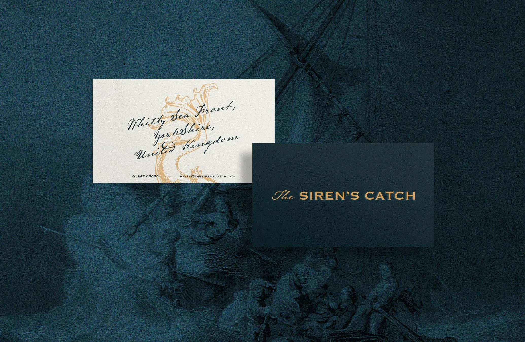
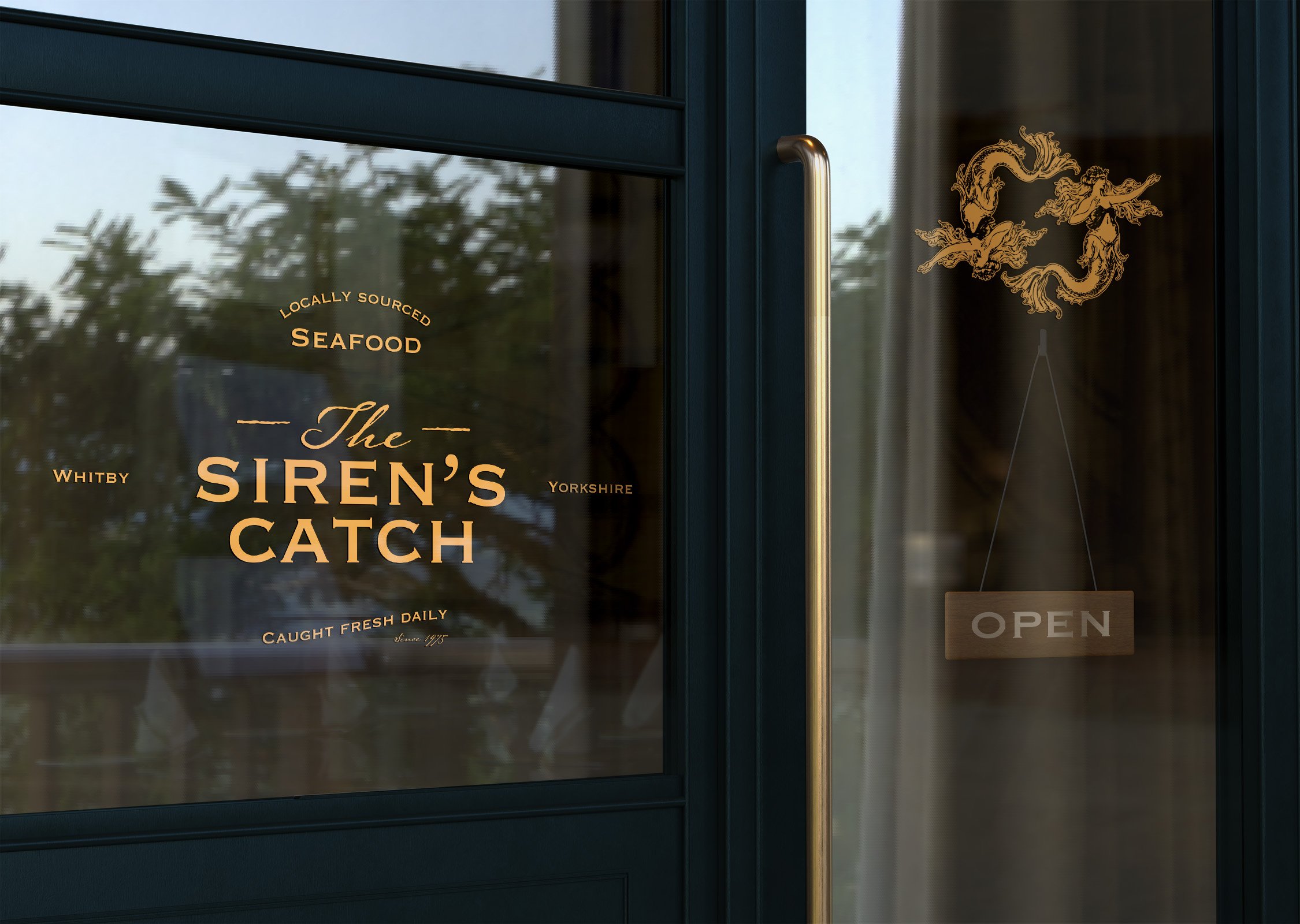
The visual identity was applied across both print and digital platforms using the adornments of our etched illustrations and colour palette to achieve the desired period and character. With all the tools created at our disposal such as the typography, imagery and textures, implementing the character across the business’ assets was simple and logical, leaving little guesswork to be made during rollout. The design elements work together to create a cohesive and engaging narrative, positioning the restaurant as a unique dining destination with charisma and intrigue.
Results
The strategic integration of design elements has successfully transformed The Siren's Catch into a lively seafood haven, where the essence of coastal life comes alive. The brand connects with patrons through its rich narrative and atmospheric identity, establishing it as a standout venue in the area.
Conclusion
Through innovative brand design, The Siren's Catch has distinguished itself in a competitive market, creating emotional connections with customers by drawing on their affinity for oceanic tales and seaside charm. This case study underscores the transformative power of strategic brand identity in crafting a unique narrative that engages its audience whilst building a deep and rich character through imagery and texture.


